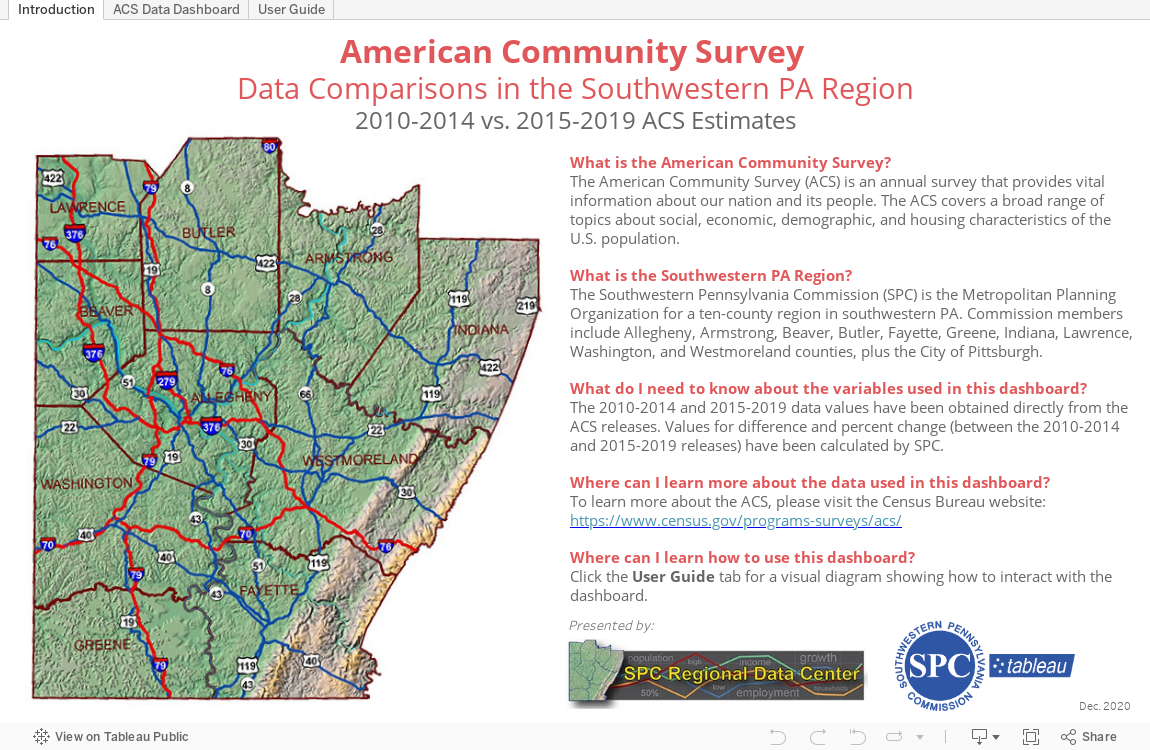
We’ve updated the SPC Regional Data Center “Visualize: SPC Tableau” with the recently-released American Community Survey Data. The dashboard can display a variety of indicators and data comparisons by municipality, county, and region, based on user selections.