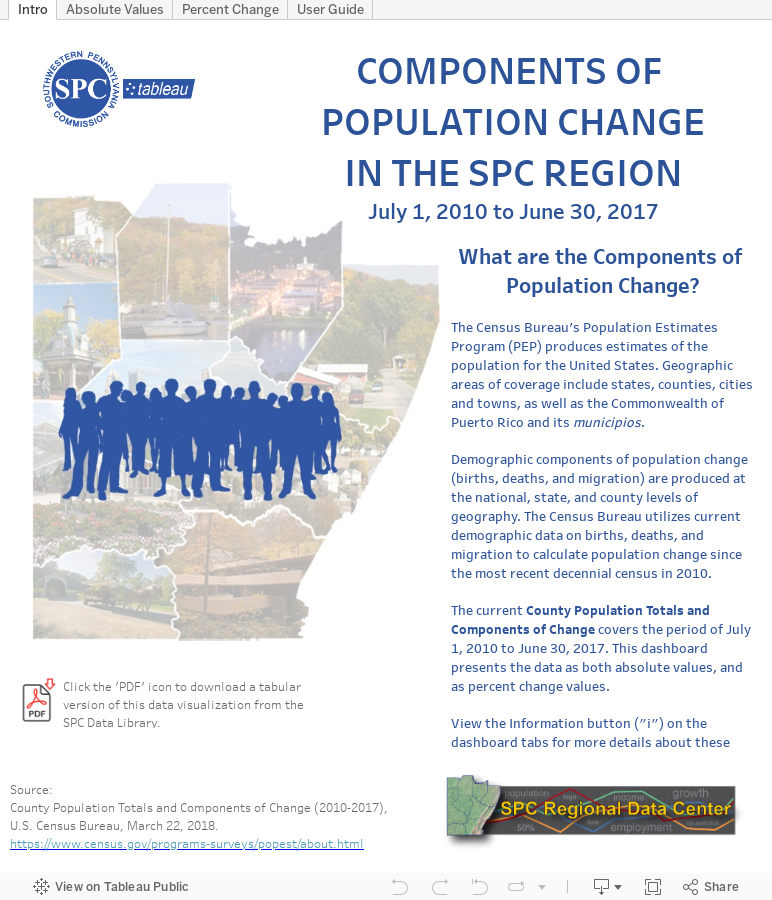
We’ve updated the SPC Regional Data Center “Visualize: SPC Tableau” with components of population change in the SPC Region. Our interactive Tableau dashboard now includes county population totals and components of change from July 1, 2010 to June 30, 2017. The dashboard can display a variety of indicators and data comparisons by municipality, county, and region, based on user selections.